

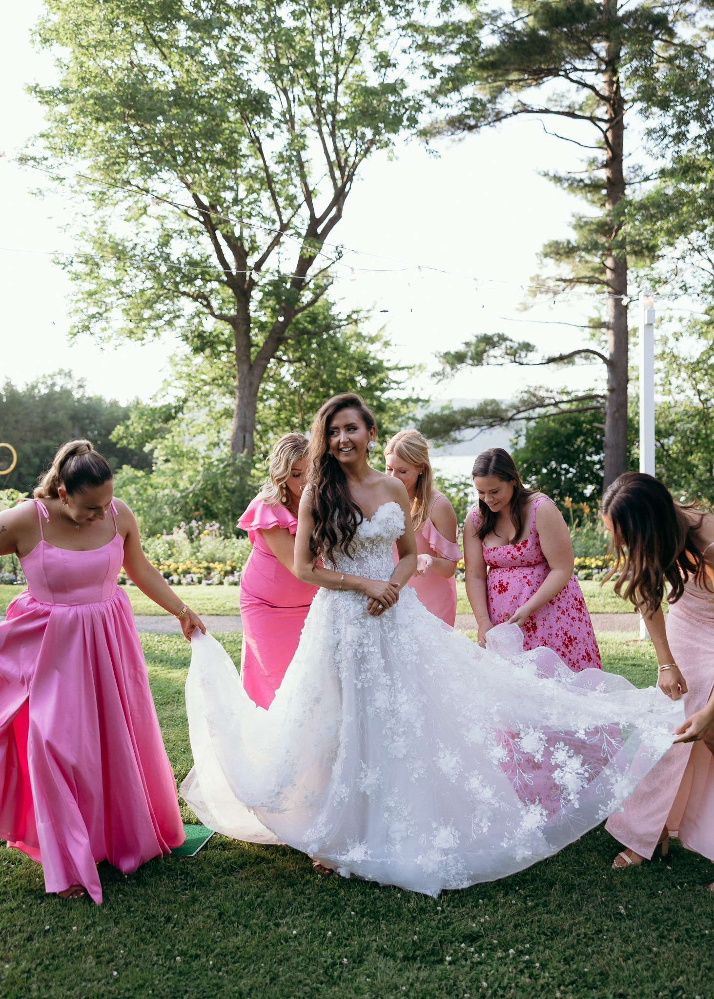
Basin Harbor’s Lake Champlain setting offers plenty of inspiration for wedding colors. The open lawns, waterfront views, and surrounding greenery create a beautiful starting point. But your wedding palette doesn’t have to mirror the landscape to feel at home here.
You might love soft pink florals against the green lawns or classic blue details that echo the lake. Maybe you’re drawn to cheerful summer colors or deeper autumn tones. Each direction can feel right at Basin Harbor when the details work together.
As a Vermont wedding photographer, I love seeing how couples bring their personalities into a setting through color and thoughtful details. Flowers, fabrics, and table settings all contribute to the atmosphere. They also give us meaningful elements to photograph alongside the people and moments that make the day yours.
If you’re gathering Basin Harbor wedding inspiration, these seasonal color palettes can help you find a direction that feels personal. We’ll look at four distinct styles, how they complement the setting, and ways to carry your colors throughout the celebration.
Key Takeaways
- Basin Harbor offers inspiration beyond classic lakeside colors. Its waterfront, greenery, and architecture can complement romantic, colorful, and richly layered designs.
- Four palettes offer a starting point. Consider Soft Garden Romance, Classic Lakeside, Fresh Summer Garden, or Rich Autumn Elegance.
- Use the season as inspiration, not a rule. Natural light, surrounding colors, and textures can guide your choices without limiting your personal style.
- Carry your colors through thoughtful details. Florals, attire, linens, and table settings can connect your ceremony and reception.
- Think about how your design will photograph. Contrast, texture, and meaningful details help preserve the atmosphere you’ve created.
Table of Contents
- How Basin Harbor’s Setting Inspires Wedding Colors
- Four Wedding Color Palettes for Every Season
- Choosing Wedding Colors for Different Vermont Seasons
- Bringing Your Color Palette Into the Ceremony and Reception
- Wedding Details That Photograph Beautifully
- Making Your Basin Harbor Wedding Style Feel Personal
- Frequently Asked Questions About Basin Harbor Wedding Inspiration
- Bringing Your Wedding Vision to Life
How Basin Harbor’s Setting Inspires Wedding Colors
One of the lovely things about Basin Harbor is that its surroundings already bring so much visual character. Lake Champlain creates an open backdrop, while the lawns and trees introduce layers of green. The resort’s buildings add another texture to the setting.
These elements can help you decide which colors to introduce and where to use them.
A soft palette of blush, peach, and ivory creates a gentle contrast against the greenery. Blues and whites can feel connected to the waterfront without turning the celebration into a nautical theme. Warmer colors, like terracotta and burgundy, can introduce depth against the landscape.
The key is to consider how your colors will look together and against their surroundings.
For example, pale flowers may look delicate in a close-up photograph. Against a bright outdoor backdrop, they might need greenery or a deeper accent to help define their shape. Similarly, a richly colored arrangement can become a focal point when paired with a simple table setting.
You don’t need every element to match. A few repeated colors can create a sense of connection between your ceremony flowers, wedding party attire, and reception tables.
I also recommend thinking about where your favorite details will appear. A floral arrangement surrounded by greenery will look different from the same arrangement against a neutral wall. Looking at the backdrop helps you make choices that feel intentional in the space.
Most importantly, let the setting support your vision rather than determine it. Basin Harbor can complement a range of visual styles, and your color palette should still feel like you.
Four Wedding Color Palettes for Every Season
A beautiful wedding color palette doesn’t have to follow every seasonal tradition. You can embrace the colors around Basin Harbor or introduce something unexpected.
These four combinations offer different ways to bring personality into the setting. Think of them as starting points, not rules. You can adjust the shades, textures, and floral choices to suit your celebration.
| Wedding Style | Color Palette | Seasonal Inspiration |
|---|---|---|
| Soft Garden Romance | Blush, peach, ivory, sage | Spring and early summer |
| Classic Lakeside | Dusty blue, pale blue, ivory, navy | Summer |
| Fresh Summer Garden | Butter yellow, cream, leafy green, white | Late spring and summer |
| Rich Autumn Elegance | Burgundy, terracotta, champagne, olive | Fall |
Soft Garden Romance: Blush, Peach, Ivory & Sage
Soft pinks and warm peach tones feel especially lovely against Basin Harbor’s green lawns. Ivory keeps the combination light, while sage adds a natural connection to the surroundings.
This palette works beautifully with garden-inspired florals and delicate details. Picture loose floral arrangements, soft fabric textures, and table settings that feel welcoming without being overly formal.
Ideas to bring this palette together:
- Blush and peach flowers mixed with ivory blooms
- Sage accents in stationery, linens, or greenery
- Cream-colored table settings with subtle pink details
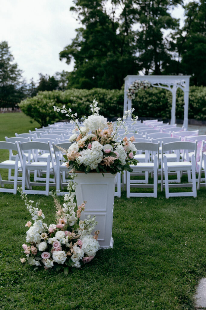
I photographed a Basin Harbor wedding featuring pink, peach, cream, and white florals. The ceremony arrangements and reception details brought beautiful color into the setting.
What stood out in the photographs was the balance. The floral colors felt distinct against the greenery while still complementing the landscape.
Classic Lakeside: Dusty Blue, Pale Blue, Ivory & Navy
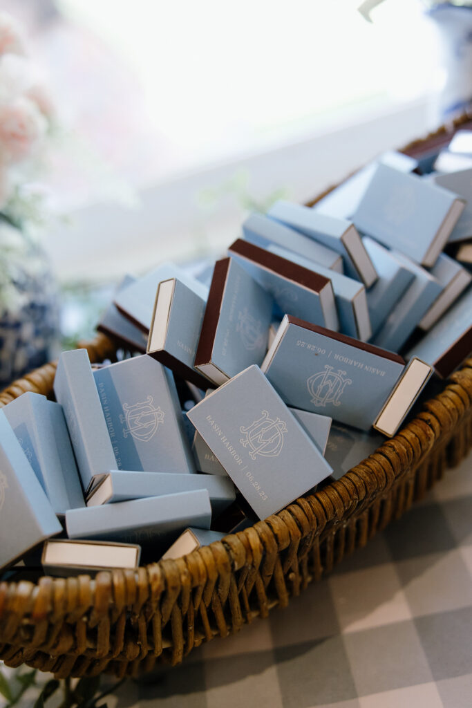
Blue is a natural choice for a wedding beside Lake Champlain, but it doesn’t have to feel nautical.
Dusty blue and ivory create a softer look, while navy adds contrast. Together, these colors feel polished without competing with the waterfront views.
Ideas to bring this palette together:
- Pale blue linens with white or ivory flowers
- Navy accents in attire, stationery, or table details
- Glassware and simple textures that keep the tables feeling airy
This combination can work especially well for summer celebrations. The lighter shades feel fresh in daylight, while deeper blue accents add definition.
For photographs, I’d pay attention to where the blue details appear. A pale arrangement against a bright background may benefit from a darker accent or greenery.
Fresh Summer Garden: Butter Yellow, Cream, Green & White
If you love a cheerful, garden-inspired atmosphere, consider bringing soft yellow into your wedding design.
Butter yellow feels warm without being overpowering. Paired with cream, white, and leafy greens, it creates a fresh palette that complements Basin Harbor’s outdoor setting.
Ideas to bring this palette together:
- Cream and yellow floral arrangements with natural greenery
- White linens accented by yellow flowers or napkins
- Simple garden-inspired details with a mix of soft textures
This palette can feel playful or refined depending on how you use it.
A few yellow accents can bring energy to a mostly neutral table. Larger floral arrangements can make the color more prominent.
I especially like the idea of giving one color a clear role. Let yellow bring the brightness, while cream and green create balance.
Rich Autumn Elegance: Burgundy, Terracotta, Champagne & Olive
Autumn offers an opportunity to introduce deeper colors and warmer textures.
Burgundy and terracotta create richness, while champagne softens the combination. Olive green keeps the palette connected to the natural setting.
You don’t need to recreate fall foliage in every detail. A few carefully chosen colors can suggest the season without making the wedding feel themed.
Ideas to bring this palette together:
- Burgundy and terracotta floral accents
- Champagne linens or warm neutral table settings
- Olive greenery paired with candles and textured details
This combination could create beautiful contrast in detail photographs. Deep florals against lighter linens help the individual colors stand out.
It also gives couples flexibility. You can emphasize burgundy for a more dramatic look or lean into champagne and olive for something softer.
Whichever direction you choose, the goal is the same: create a palette that feels connected to your wedding, not simply the calendar.
Choosing Wedding Colors for Different Vermont Seasons
Each season brings a different atmosphere to Basin Harbor. The changing landscape, natural light, and surrounding colors can influence how your wedding design comes together.
You don’t need to follow traditional seasonal colors. Instead, think about how your favorite shades will look against the setting during your celebration.
| Season | Color Direction | Design Considerations |
|---|---|---|
| Spring | Soft pinks, ivory, sage, pale yellow | Fresh greenery, delicate florals, and light fabrics |
| Summer | Dusty blue, white, butter yellow, leafy green | Bright outdoor settings, airy textures, and colorful accents |
| Fall | Burgundy, terracotta, champagne, olive | Richer florals, warm neutrals, and layered textures |
Confirm seasonal wedding availability and event options directly with Basin Harbor.
Let the Landscape Influence Your Choices
Vermont’s scenery changes throughout the year, but your colors don’t need to match every shade outdoors.
For a summer wedding, a soft palette can stand out against vibrant greenery. In fall, lighter flowers and neutral linens can provide contrast against deeper seasonal tones.
I recommend choosing two or three main colors before adding smaller accents. This creates a consistent look without making every detail feel identical.
Consider How Natural Light Affects Color
Color can look different depending on the light and surrounding surfaces.
Pale flowers may appear especially delicate in soft light. Under brighter conditions, deeper accents can help define their shape and texture.
When selecting your palette, look at how the colors work together in both bright and shaded settings. This is particularly helpful when your ceremony and reception have different backdrops.
The season can inspire your choices, but your personal style should guide the final design.
Bringing Your Color Palette Into the Ceremony and Reception
Once you’ve chosen your colors, the next step is deciding where to use them.
You don’t need matching flowers, linens, and accessories everywhere. Repeating a few thoughtful details can create a cohesive look while giving each space its own personality.
Start With Your Ceremony Details
Your ceremony often provides the first impression of your wedding design.
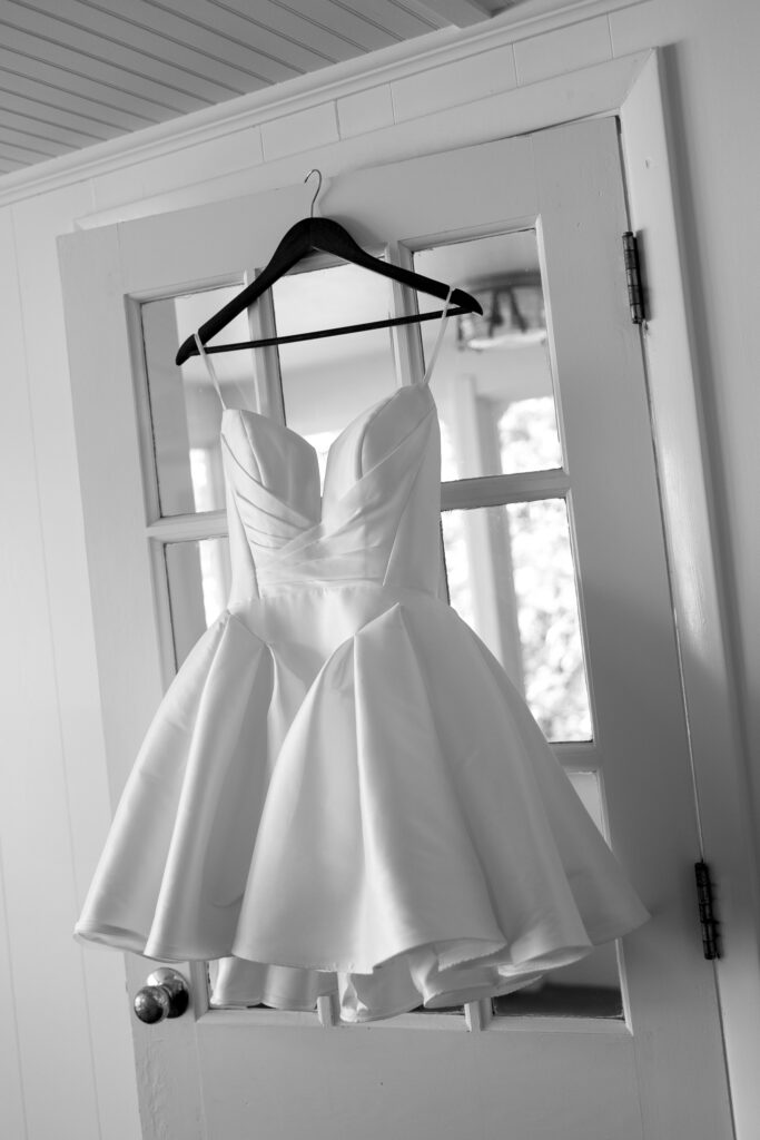
Floral arrangements, aisle details, and wedding party attire can introduce your palette without overwhelming the setting.
At Basin Harbor, I photographed a ceremony with pink, peach, cream, and white florals. The arrangement added color against the outdoor backdrop while allowing the surroundings to remain visible.
For your own ceremony, consider:
- Floral arrangements: Choose a mix of shades that gives your palette depth.
- Wedding party attire: Introduce one of your main colors through clothing or accessories.
- Ceremony accents: Repeat a subtle color or texture in smaller details.
You can also let the setting do some of the work. A beautiful outdoor backdrop doesn’t always need extensive decoration.
Carry the Colors Into Your Reception
Your reception gives you opportunities to introduce more texture and detail.
Linens, centerpieces, candles, and table settings can all support your chosen palette. Rather than repeating the ceremony design exactly, look for ways to carry its colors into a new arrangement.
| Design Element | How to Use Your Palette |
|---|---|
| Centerpieces | Repeat key floral colors with varied shapes and textures |
| Table linens | Use a neutral foundation or introduce a main color |
| Napkins and stationery | Add smaller accents without overwhelming the table |
| Candles and glassware | Introduce warmth, texture, or subtle contrast |
| Personal details | Include colors in meaningful items when they fit naturally |
Keep the Overall Design Connected
One of the simplest ways to create consistency is to choose a few elements that appear throughout the day.
For example, you might repeat a floral color from the ceremony in your reception centerpieces. A shade from the wedding party attire could also appear in your table details.
The connection doesn’t need to be obvious. Small repetitions help the spaces feel related while allowing each one to have its own character.
From a photography perspective, this also creates visual continuity. Your ceremony flowers, reception tables, and smaller details become part of the same story.
The result feels thoughtful without requiring every element to match.
Wedding Details That Photograph Beautifully
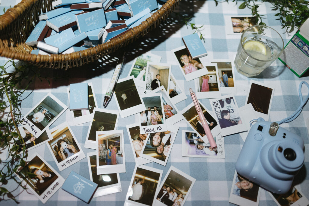
Your wedding colors come to life through the smaller details. Flowers, fabrics, stationery, and table settings all contribute to the atmosphere you’ve created.
As a photographer, I look for ways to capture those choices with intention. Sometimes that means composing a photograph around the shape of a floral arrangement. Other times, it’s noticing how the light falls across a beautifully set table.
The goal isn’t to photograph every decoration. It’s to preserve the details that help tell the story of your celebration.
Give Your Colors Room to Stand Out
Contrast can make a meaningful difference in how wedding details appear in photographs.
For example, pale flowers may blend into a light tablecloth. Adding greenery, a textured vessel, or a deeper accent can help define the arrangement.
The same principle applies to stationery, attire, and ceremony flowers.
| Design Detail | Photography Consideration |
|---|---|
| Floral arrangements | Mix shades and textures to give individual blooms definition |
| Table settings | Leave enough space for important details to stand out |
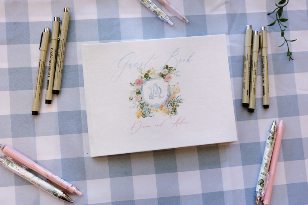
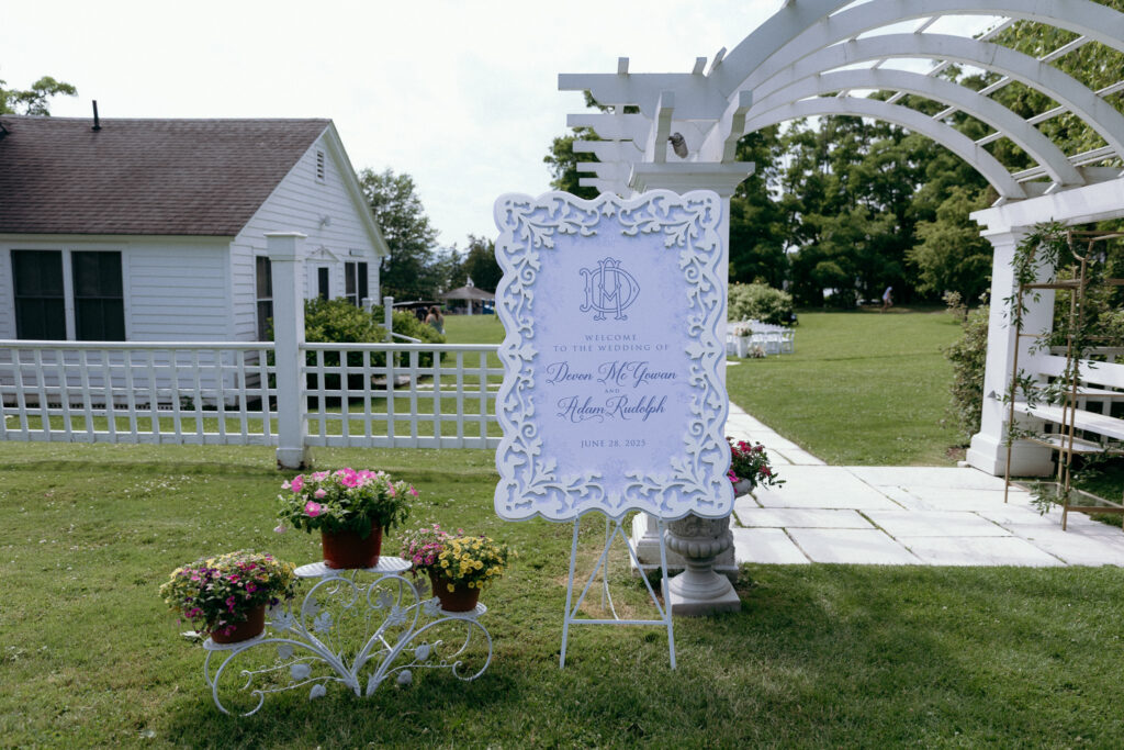
| Stationery | Choose backgrounds that complement the paper and lettering |
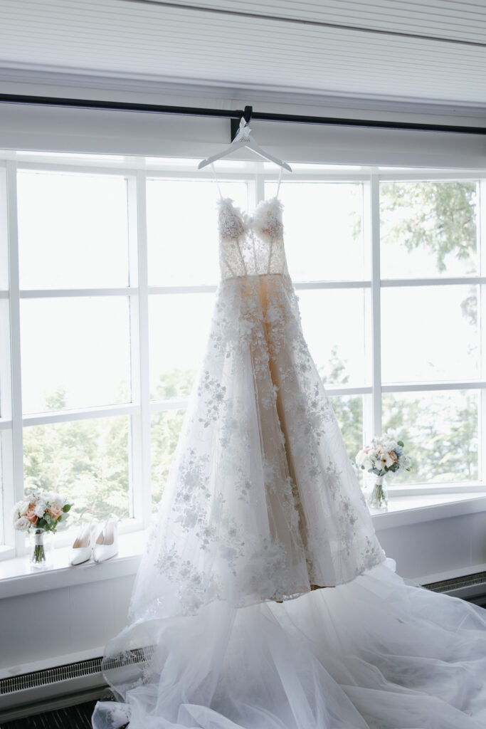
| Wedding attire | Consider how fabric colors appear against the surroundings |
| Personal accessories | Keep meaningful pieces together when possible |
You don’t need to add more decorations to make a photograph interesting. Often, a thoughtful combination of color, texture, and space creates the strongest image.
Think About Texture Alongside Color
Two weddings can use similar colors and still feel completely different.
Soft linen, smooth glassware, delicate flowers, and textured paper each bring something unique to a design. Those differences become especially noticeable in close-up photographs.
I love capturing details that show both the overall arrangement and the smaller elements within it.
A photograph of a reception table can show how everything works together. A closer composition can highlight the shape of the flowers, the fabric, or a carefully chosen place setting.
Both perspectives help preserve the thought behind your wedding design.
Choose Details That Matter to You
Not every detail needs to follow your color palette perfectly.
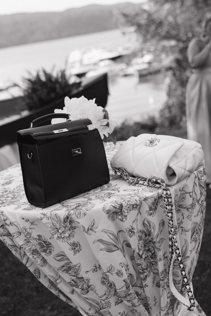
A family heirloom, handwritten note, or meaningful accessory may have a completely different look. That doesn’t make it any less important to photograph.
I approach these elements with the same care as the larger design. A beautiful wedding gallery should reflect more than coordinated colors. It should also preserve the things that made the celebration personal.
Making Your Basin Harbor Wedding Style Feel Personal
Wedding inspiration is helpful when you’re discovering what you love. But the most memorable designs often come from making a few choices that feel genuinely yours.
Basin Harbor offers a distinctive setting, yet your celebration doesn’t have to follow one particular style.
You might prefer a soft garden palette, classic lakeside blues, or richer seasonal colors. You can also combine elements from different styles when they work together.
Start With the Details You Already Love
Before choosing every color and decoration, think about what naturally appeals to you.
Maybe you’re drawn to colorful flowers, simple table settings, or a particular fabric. Those preferences can guide your design more meaningfully than following a seasonal trend.
A few questions can help narrow your direction:
- Which colors do you naturally gravitate toward?
- Do you prefer soft, understated details or stronger contrasts?
- Are there meaningful objects or traditions you’d like to include?
- Which design elements matter most to you?
You don’t need an elaborate theme to create a cohesive wedding. A few thoughtful decisions can make the celebration feel complete.
Choose Where to Make an Impression
If you love flowers, you might want your ceremony arrangements to become a focal point.
If gathering around the table matters most, you may prefer to focus on reception styling. Colorful linens, thoughtful centerpieces, and personal place settings can help create a welcoming atmosphere.
Consider choosing one or two areas where your design will make the greatest impression.
This approach gives your favorite details room to shine without requiring every part of the wedding to feel heavily styled.
Let Your Wedding Feel Like Your Own
The best wedding inspiration gives you ideas without making you feel like you need to recreate someone else’s celebration.
You can borrow a color combination, adjust a floral style, or introduce an unexpected detail. What matters is how those choices come together for you.
When I photograph a wedding, I want the images to reflect both the atmosphere and the people who created it.
That includes the thoughtfully arranged details, but also the interactions happening around them. A beautiful table setting becomes part of a larger story when guests gather, celebrate, and make memories there.
Your wedding design sets the scene. The people and moments give it meaning.
Frequently Asked Questions About Basin Harbor Wedding Inspiration
What colors work best for a Basin Harbor wedding?
Basin Harbor’s lakeside setting can complement many different color combinations.
Blush, peach, and ivory create a soft garden-inspired look. Dusty blue and white offer a classic lakeside feel. Butter yellow brings brightness, while burgundy and terracotta introduce warmth.
The best palette depends on your personal style, wedding season, and the atmosphere you want to create.
Do wedding colors need to match the season?
Not at all. Seasonal colors can provide inspiration, but they don’t need to determine your entire wedding design.
You can use soft pastels in fall or richer colors during summer. Consider how your chosen shades will look against the landscape, then adjust the accents and textures to suit the setting.
How many colors should I include in my wedding palette?
Two or three main colors provide a helpful starting point. You can then introduce neutrals, greenery, or smaller accent colors.
For example, blush and peach can lead a romantic palette, while ivory and sage create balance.
You don’t need every flower, linen, or accessory to match. A little variation often makes the design feel more natural.
How can I make my wedding colors look beautiful in photographs?
Think about contrast, texture, and where your details will appear.
Light flowers may stand out more against greenery or a deeper accent. Different fabrics and materials can also add visual interest, even when they share similar colors.
Your photographer can capture both the complete design and the smaller details that make it distinctive.
Can I combine different wedding themes at Basin Harbor?
Yes. You might love classic lakeside colors but prefer garden-inspired florals. Those ideas can work together when you repeat a few complementary shades and textures.
Rather than trying to follow one theme perfectly, focus on creating a celebration that feels cohesive and personal.
Bringing Your Wedding Vision to Life
Choosing your wedding colors is one of the many ways to make Basin Harbor feel like your own.
Maybe you love soft garden florals, classic lakeside blues, or the warmth of an autumn palette. Whatever direction you choose, the most meaningful details are the ones that reflect you.
As a Vermont wedding photographer, I love documenting how those choices come together. I take time to photograph the florals, textures, and thoughtful design details you’ve chosen. I also pay attention to the moments unfolding around them.
That balance matters to me. Your photographs should preserve the beauty of your wedding design and the feeling of being there.
If you’d like to see how these details come together in a real celebration, take a look at my Basin Harbor wedding photography feature. You can also read my Basin Harbor wedding venue guide for more about the setting.
And if you’re looking for someone to photograph your Basin Harbor wedding, I’d love to hear what you’re envisioning. Get in touch to tell me about your plans.

At the heart of it all, I’m passionate about authentically capturing your story, blending artistic flair with a documentary approach. As your Vermont wedding photographer, my style is all about creating images that feel real and true to who you are, with just the right touch of creativity to make them stand out. Whether it’s the quiet, intimate moments or the big, joyous celebrations, I focus on capturing the essence of your day in a way that feels both timeless and uniquely you.
Meet your photographer
Liz Bashaw

Your story deserves to be documented with care, wherever you are in your journey. From your engagement to your wedding day and the quiet, beautiful moments that follow, every session is rooted in connection, artistry, and the timeless character of New England.


Elegant, effortless, and true-to-tone — I capture weddings across Vermont and New England with a documentary style that blends refined direction and natural emotion. Every image preserves the laughter, light, and love that define your celebration.
Starting at $7,000
Weddings
Your engagement session is the beginning of your story. As a Vermont engagement photographer, I’ll capture the ease and excitement between you in locations that reflect your personality — from lakeside strolls to mountaintop views.
Starting at $850
Engagement
These are the fleeting, heart-centered moments that become your family’s first memories. As a Vermont lifestyle photographer capturing newborn, family, maternity and more I focus on natural light, gentle direction, and the quiet joy of your growing connection.
Starting at $750


